A little about Typography
I’ve found myself recently drawn to certain typefaces, particularly Helvetica. There’s some reassurance, boldness, comfort and trust I feel when I look at this font. I am not sure why, maybe some childhood poster nostalgia, maybe it’s something else. But I’ve always felt drawn and “targeted” by some certain design choices, and typography is one of them. So I decided to do a little research so I can familiarize myself a bit with typography and these are my notes.
Typography refers to the art and technique behind arranging words, letters and characters in printed material that affects readability and legibility. Good typography grabs attention, builds hierarchy and brand recognition. Without effective typography, designs fail to communicate to their intended audience.
Typeface. A typeface groups similar/related types of text e.g Helvetica, Roboto. These share common design features. Think of this as your font-family if you’ve written CSS before but if you haven’t we will look more into the differences shortly.
Fonts. Particular styles within a typeface e.g Helvetica bold, thin, extra bold. Or, if you are from a CSS background, this is your font-style. We typically interchange typeface and font because Steve Jobs, who first brought fonts to the mac after taking a Calligraphy class, referred to them as fonts and not typefaces and that stuck. So in the digital design world, particularly in writing code, its common to see fonts and font families and not typefaces.
Typefaces
Before the Gutenberg printing press books had to be transcribed by hand. Yes, text, usually religious text, had to be transcribed by monks, by hand, a long and tedious process. You had innovation in other civilizations e.g the Chinese that allowed them to print letters on clay and more innovation in other parts of the world but the printing press was the first time paper and print really came together, and of course, that that’s the format we still use today for any physical text material.
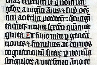
When Gutenberg made the printing press, he used BlackLetter, the same typeface that was used by monks to transcribe text. BlackLetter was hard to read, not only in writing but in any print material as you can see form the sample text. The need for better legibility started a revolution to discover the best font for print/modern material. And just like European art, the font space started its own revolution mostly driven by rebels and creative types. And just like that, newer typefaces were invented
Serif
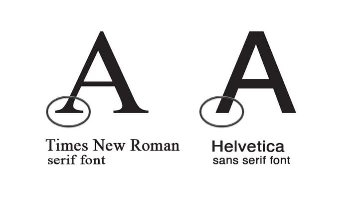
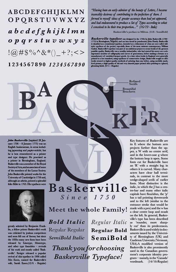
Serif typefaces have accents/decorative lines/flourishes on them called serifs. They were first invented by Nicholas Jensen after chopping the flourishes off calligraphy script. He called it the roman type face. Associated with stability enduring value and tradition, they have been around a long time. They are used by banks, jewelers and lawyers. Serif typefaces are good for times less design but bad for contemporary designs or playful designs. A good example of a serif font is Times New Roman
Sans-Serifs
Sans means without in french, so san serifs means without serifs
They are versatile, as they lack a distinctive personality. Sans Serif fonts have a lot of variability in terms of their font styling. You can change size, boldness, italisize them, change amount of boldness and how thick the font appears.
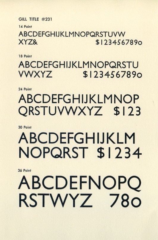
They are usually also very legible. You can use one type face for your entire brand ie you can use the thick & bold (both adjustable) variant for your headings and thinner lighter (both adjustable) variant for paragraphs. They are the default choice for 90% of consumer products and are used in logos, ads, license plates, key caps, billboards, packaging and company logos. e.g Google, Spotify, Microsoft, Facebook, Chanel.
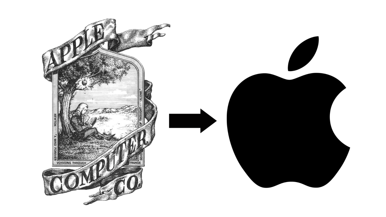
They were invented to remove decorations from type faces. They feel more modern, because contemporary design removes a lot of ostentation, fancy decorations. As evident in the evolution of the apple logo.
Slab Serifs
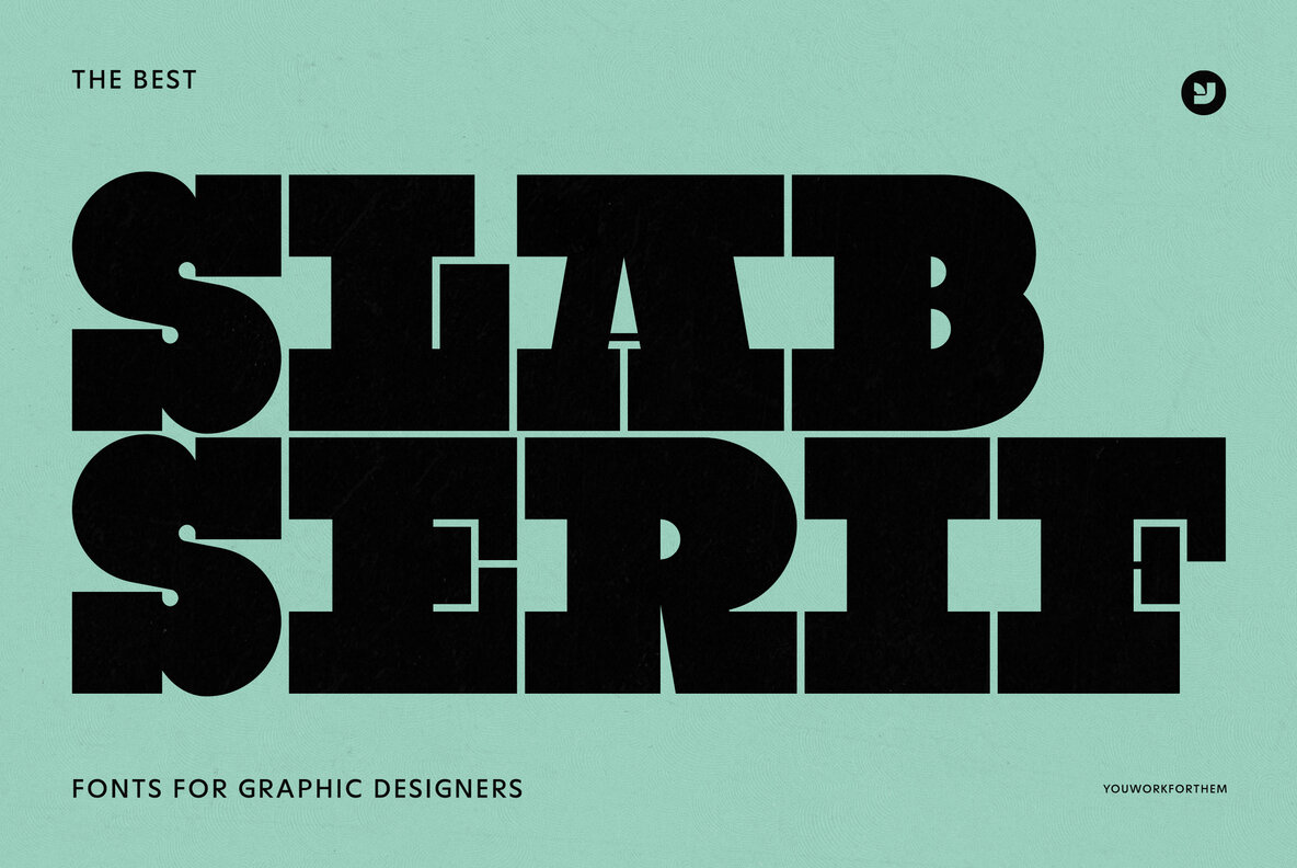
Slab serifs are just as bold as Serif fonts with a twist on the serif ornamentation. The serifs have strong bold and modern aesthetic, ostentations meant to draw attention. These will commonly be used in headers and logos.
Display typefaces
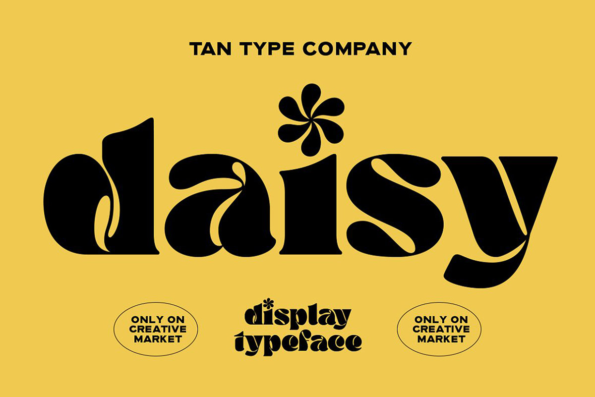
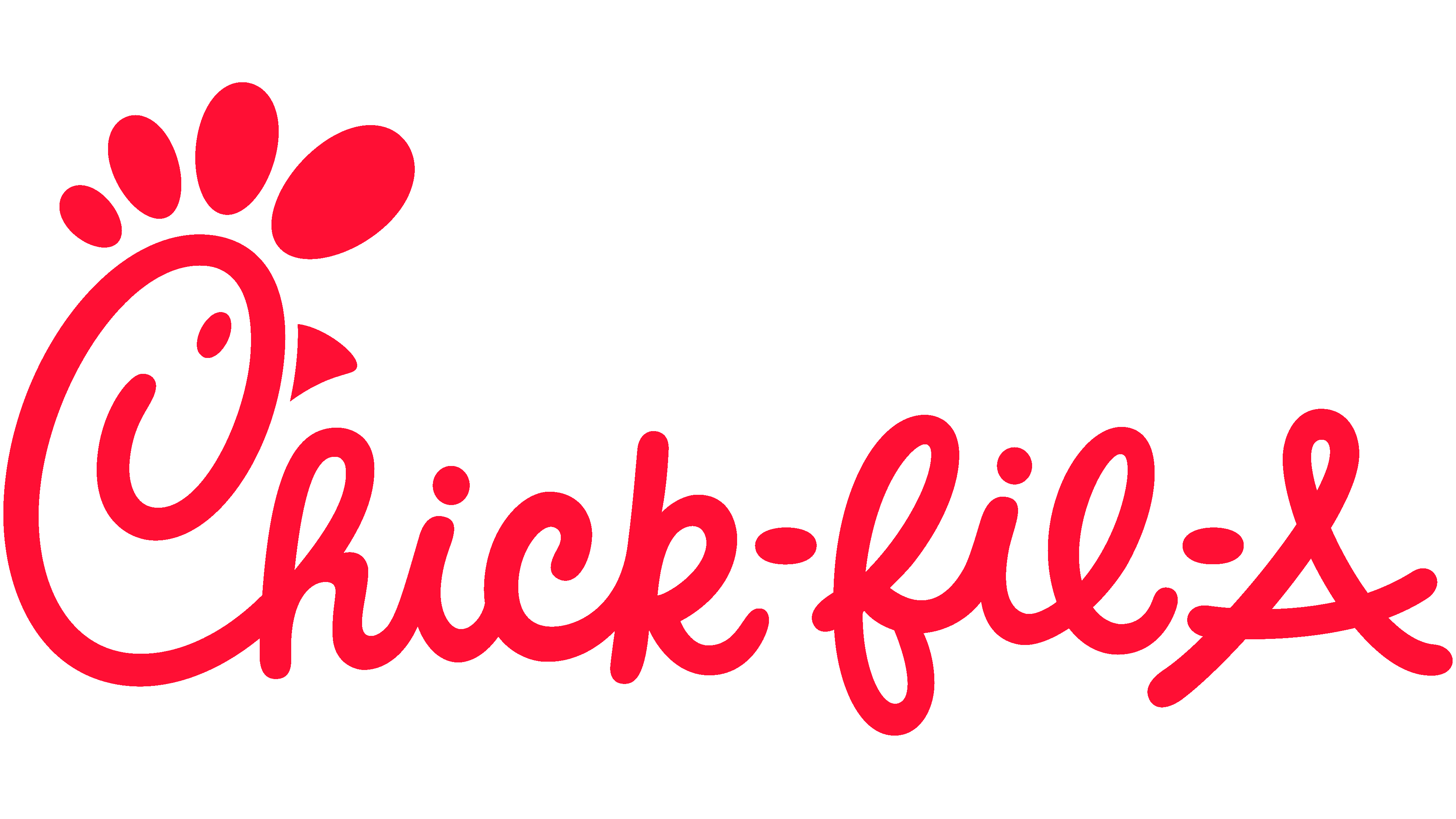
Display fontfaces can be serif or even San-serifs. They are mostly meant for single lines of text and are usually applied in logos or landing pages. Think chick-fil-A or Tesla. They don’t make good paragraphs but are designed for single lines of text. These are often stylistic and unique and gained popularity during the advertising age.
Script typefaces
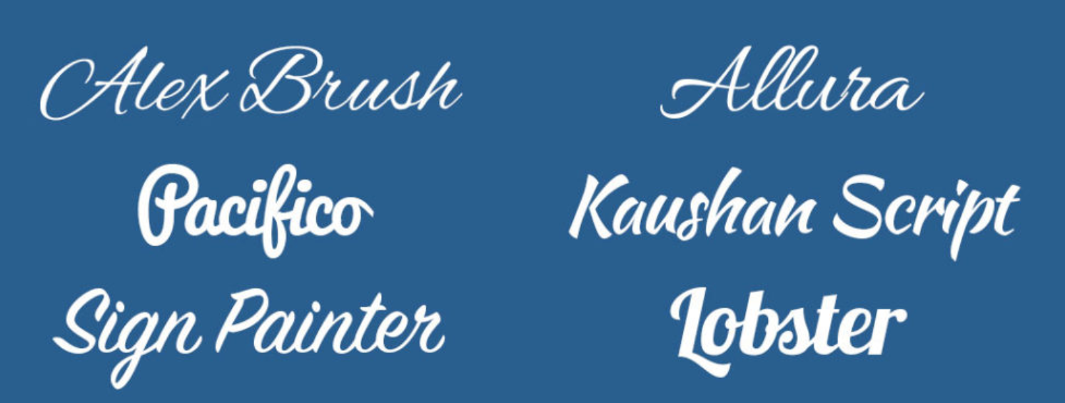
Script typefaces are meant to look like old school calligraphy, inspired by handwriting from the 17th century. Based on the flow of cursive handwriting, they are great for headers, titles and any types of display text. They are often used on wedding invitations and diplomas.
Pixelated Typefaces
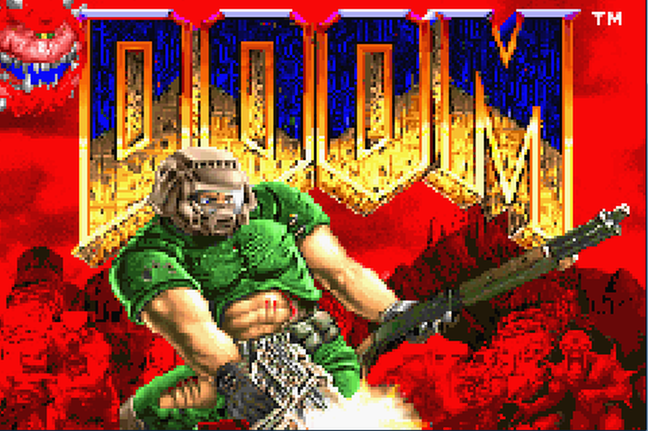
Also known as bitmap fonts originated in the 1980s with the rise of computer graphics and video games.
Monospace Typefaces
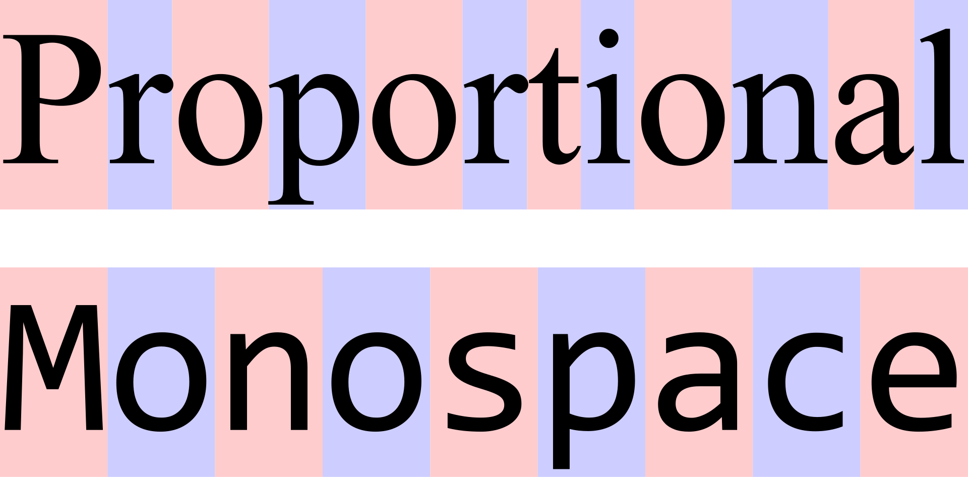
Monospace fonts occupy the same horizontal space, unlike proportional fonts like Helvetica where the “I”s might have different spacing from the “W”s.
Some Monospace typefonts like Courier mimic old typewrites. Monospace typefaces work great in well structred environments where things like aligment matter e.g code editors.
Beyond typefaces - Font Design
Beyond typefaces, the nuances of weight, sizing and spacing influence how we perceive text and interact with written information. Font design goes into what makes font stand out, be legible, have visual prominence and hierarchy, reading comfort, contrast and determine how easily our eyes can move across a piece of text which might affect concentration for ADHD types, myself included.
Font design can help you evoke certain emotions, memories, can convey strength, elegance or sophistication. Understanding a few of elements of design can help you more effectively use fonts to create designs that convey harmony to readers.
Font Weight
Font weight refers to the Boldness or Thinness of a font. Bolder fonts demands more visual attention so they are used for titles. Thinner fonts are easier to read so better for paragraphs or long lines of text. Thinner lines can also be used to convey sophistication especially when they are written in cursive.
Font Sizing
Font size if a primary tool for establishing hierarchy. Larger fonts are used for headings while smaller fonts are used for paragraph text. Designers typically measure font size in rems which are relative units of measurements used to standardize size recommendations.
EM. Stands for equal measurement. Sets the character of a character equal to the size of a font. on the web the size of a font is 16px, so if you wanted a heading to be 32px, you would set it to 2em. This allows relative sizing.
REM. Stands for root EM. Sets size relative to the root font size. You can set root font size as below
Font Spacing
Good font spacing is important for accessibility particularly with people with visual impairments.
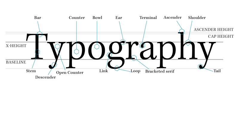
Baseline - Invisible line upon which your font rests. e.g school line papers.
Cap line - A cap line determines how high up fonts can go, or their limit vertically.
X-height - This is a line that constrains the height of the lowercase letters.
Line height/Leading - The space between lines. Measured from baseline to baseline. Crucial for readability especially in long blocks of text.
Should be inversely proportional to size of the font. The larger the font the smaller the line height. This increases legibility.
Letter Spacing/Tracking - The space between each letter. Should also be inversely proportional to the size of the font. Bigger fonts are easier to read thus more legible with less letter spacing compared to smaller fonts which can be harder to distinguish so need more spacing.
Kerning - Kerning is the reduction of increasing of space between individual letters.
So there you go, there’s a lot more about typography that you need to consider beyond typefaces, fonts, font sizes, kerning, line height e.g color contrast, hierarchy, responsive typography for the web e.t.c but I think this is a nice introduction to the basics of typography.
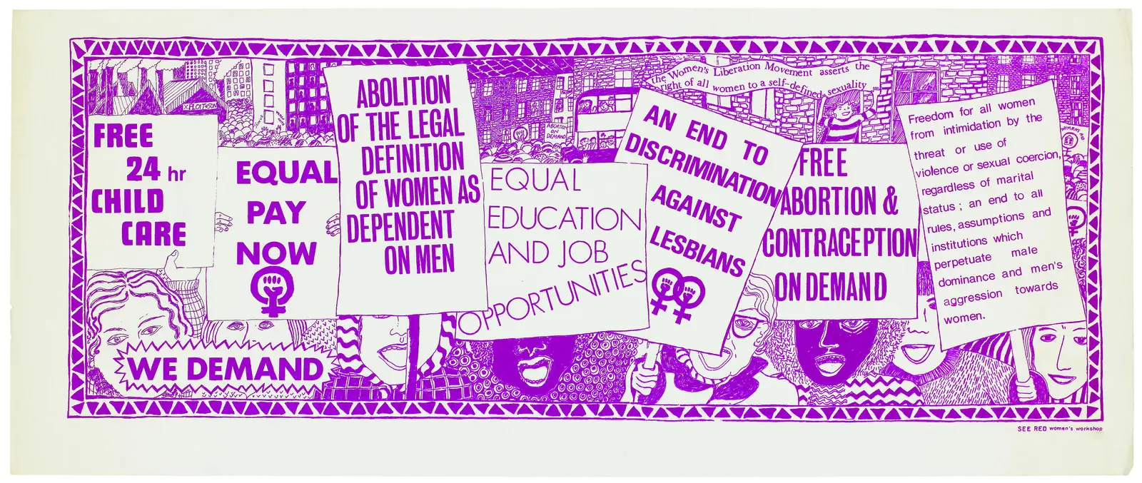
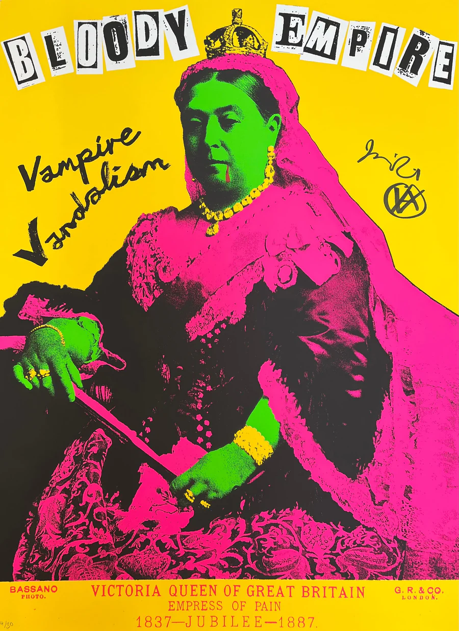
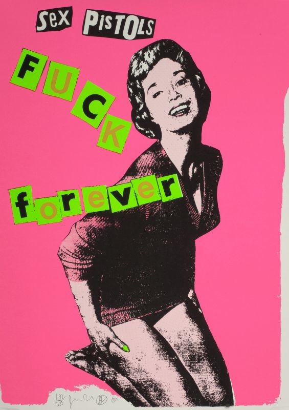
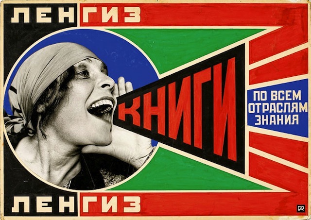
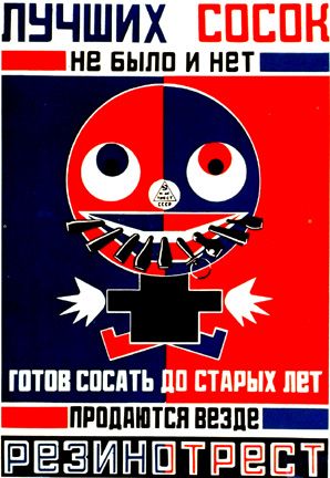
I researched some designers and will leave you with some designs from James Reid, Alexander Rodchenko, Varvara Stepanova and others that highlight how important typography can be for thought provoking messaging e.g protest posters and I hope you get some nostalgia or inspiration looking at these as well.

References & Resources
Design Spo Youtube
https://fonts.google.com/
Dafont Free - Download Fonts
I promise this story about fonts is interesting
Fontsource
WhatFont - Chrome Web Store
https://type.method.ac/